10 UI Design Principles for Business Success in Mobile Apps
Mobile application user interface (UI) design refers to the choices surrounding an application’s visual and interactive user experience. These...
An app icon is a digital billboard for your business. Having an app icon that stands out and can immediately hook your audience will help set the app apart from the millions available. With such little space available on the square icon, it’s important to hit hard with its design. While there is room for creativity, there are some specific “do’s and don’ts.” Below, we’ll get into flushing out these tactics that will give you a leg up on the competition.
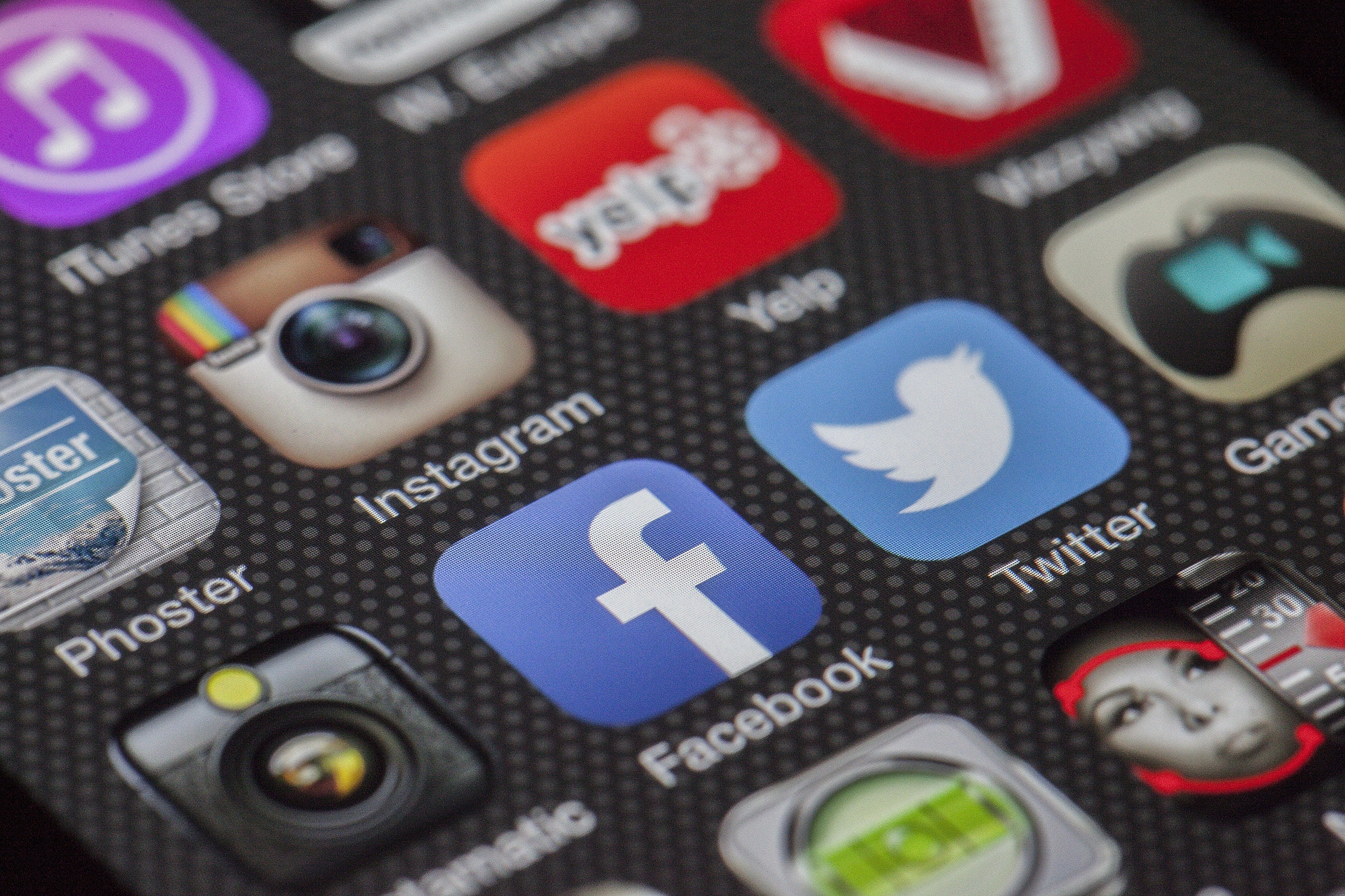
An app icon is the image tile that we’re all familiar with seeing in the app store, and on our mobile phones and tablets, which lets us know what program we’re trying to access. It’s a graphic thumbnail.
Let’s first clarify that an app icon is not a logo. The same design does not need to be used in both places. Can an icon also be the company’s logo? Of course, just like how Nike uses their logo swoosh as the app’s graphic for the icon. The point is that it doesn’t have to be.
App Icons will be seen in all sizes, ranging from the smallest blip when in someone’s subfolder on their mobile phone’s screen to a large web-app icon on an oversized computer screen. It is important that the icon looks good on all devices in all sizes, which is why app design can matter so much.
A good app icon design is like good product packaging in a retail store. It will get people’s attention, convert into more downloads, which then leads to better ranking in an app store, thus broadening the base of people being shown the app… and thus continuing the growth cycle.
But if your app icon doesn’t resonate with your audience and is not downloaded, then you can expect it to be slowly pushed to the bottom of the pile where it could hang out in the tech version of no-man’s-land for a long time. This is why it’s important to make sure your app has the right mixture of ingredients to set the business up for success.
Apps in the same industry tend to have similarities in their icon looks. For example, a lot of food apps are red (think DoorDash, Papa Johns, and Smoothie King), whereas gaming apps commonly use a close-up of a character’s face. If a wine and cheese company chose a cartoon face for their app icon, it could lead users to miscategorize that app as a gaming app. Doing some research to see the icon design of other apps in your app’s category can help ensure that you fit the industry’s vibe and give users the correct idea of what your app is about.
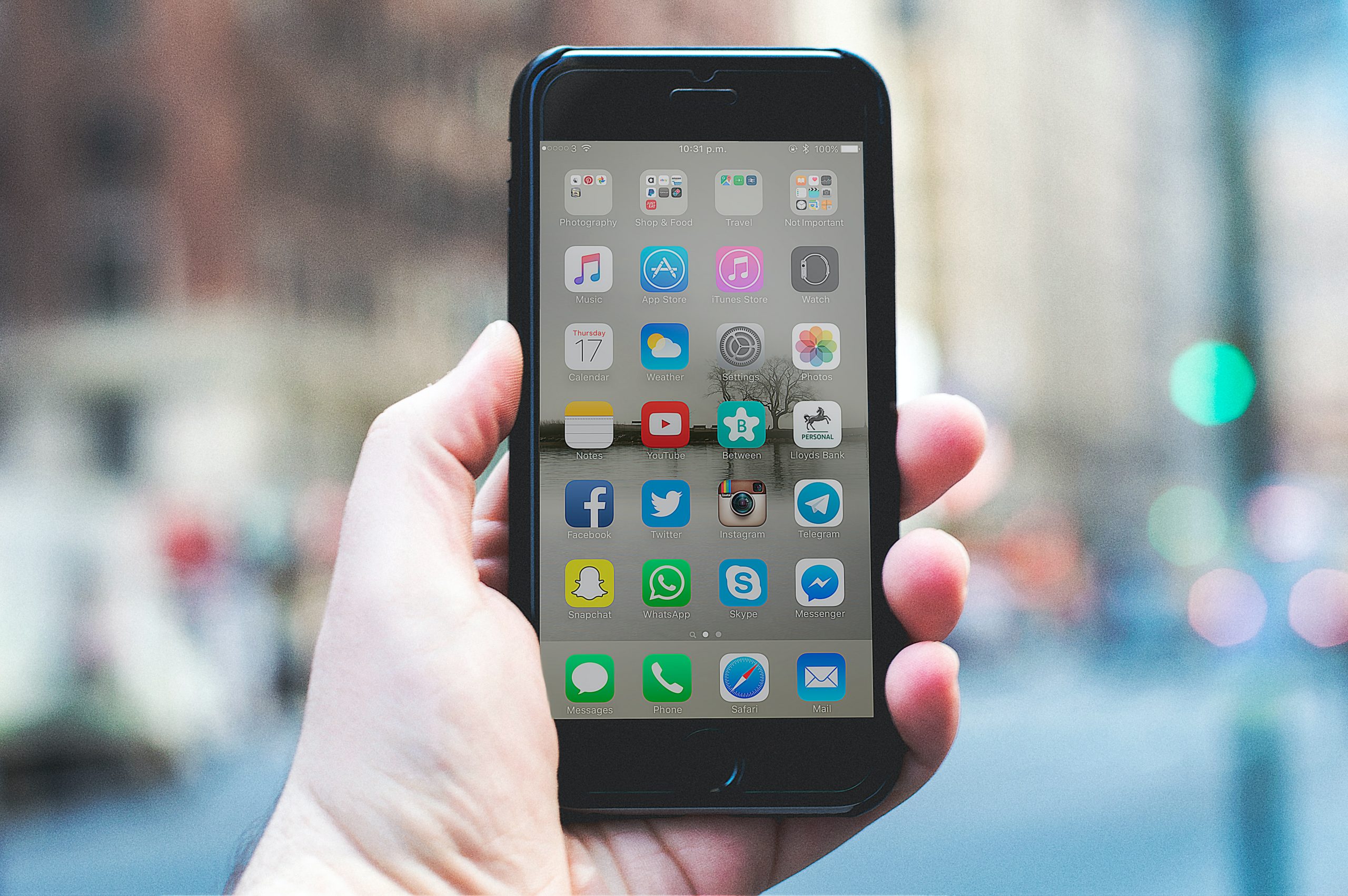
App icons are not the same across all devices. The icon needs to look good on a big desktop monitor, a tablet, and even folders on a mobile phone. Spending time on making a good app icon design will better the chances of the icon remaining clear across all devices and not accidentally appearing cluttered in smaller forms.
There are a couple of generic rules to help guide creating an app icon. Though there is always an exception to the rule, following these tried and tested practices will give your icon a leg up on the competition.
Though an elaborate design for an app icon might seem tempting, the simpler the better. It needs to be easily recognizable amongst other apps on a user’s phone. It’s not ideal if someone has to squint to distinguish between overcrowded figures on the icon.
Consider a mobile phone background. It could be a busy image of someone’s family or even a detailed live wallpaper. You want an app that pops against any background. Using fewer design graphics will prevent it from getting lost in the details. A flat vector image for the app icon will also reduce the clutter that comes with real photos and detailed graphics.
Let’s start with the exceptions. Uber. Lyft. Yelp. All of these companies have their name on their icon. The other thing they share is they’re all 4 letter names. Though nearly as brief as a business name can be, these words still max out an icon’s free space. For these companies, their name is also their logo. So if a company happens to have a 4 letter name that doubles for their logo, then it can just fit onto an app icon.
In general, icons are too small for company names and words to remain legible. Imagine if McDonald’s used its full name instead of their trademark letter M. It would be so tightly scrawled on the app it would become unreadable. It’s much preferable to use a single letter, like how Splice uses an “S,” or invest in an eye-catching graphic and ditch the words altogether.
If colors or lines on an app icon blur into each other, it can make the design harder to understand. There are simple tricks to counteract this, such as adding a border. Snapchat outlines its white ghost symbol in black, so it standouts against the yellow background.
Another trick is to use shading sparingly. Shadowing can make a graphic appear cluttered, especially in smaller sizes. Also, the technique is not commonly used anymore, so a modern icon would run the risk of looking outdated. Most apps on the market lean into a color gradient as opposed to shadowing.
If you open Spotify’s green and black app, you see a black home screen filled with green text and play buttons. Using a matching color palette creates a synthesis between the icon and the platform. It creates a cohesive journey for the user. This doesn’t mean the colors have to always be the same, but sticking with the overall essence of the app and reflecting that on the icon generates a positive user experience.
Color theory in the digital world is an expansive topic. A simple place to start determining what colors you should choose for your app is by looking at other apps in the same category. It’s important to match your category in color tones, as stated before, while still standing out from the crowd.
For example, a lot of photo editing apps use orange and pink gradients à la Instagram. The app Afterlight incorporated this recognizable element but stands out by ramping up the vividness of the gradient and putting it on top of a black background. This helps the app stand out against the sea of ‘camera icon’ photo editing apps.
A second tip with color is to not use more than three distinct ones. Most apps only use two, creating a look that is easy to distinguish against almost any background. The most popular color for an app is overwhelmingly blue. So if you scroll through an app store, you’ll start to see a lot of white figures on blue backgrounds and vice versa. Even amongst the most popular apps like Facebook, Venmo, LinkedIn, Calm, Twitter, and Microsoft Outlook, all are variations of this color scheme. That being said, going with a blue color scheme is not going to guarantee success. It’s better to start researching similar apps and then reserve engineer 2-3 colors that seem to do well.
1. PictureThis: The app lets you take pictures of a plant to identify the species and care tips. It sounds like a complicated idea to get across, but the app icon does this beautifully. The colors and center image let you know the app is about plants, while the familiar “camera” outline denotes an action with taking photos. It’s also a slightly different green hue than what you usually see for gardening apps.

2. AllTrails: What comes to mind when you think about hiking? Mountains. Which is exactly what AllTrails leaned into for their hiking route app. A simple outline of a mountain on a background that subtly represents the lines on a topographic map gets you in the mood to explore nature.

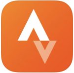
3. Strava – Orange is a color that emotes energy and excitement- it gets your blood pumping, which is great for a running-centric fitness app. Strava chose to not use yet another outline of a person running for their graphic. Instead, they incorporated the “A-V-A” letter designs in their name on the app icon. The designers aligned it so it also resembles a compass, which is handy as Strava can track your running route. The icon fits the feel of a fitness app, while cleverly distinguishing it from other similar apps.
4. Among Us!– Most gaming apps use one of the game’s characters on the icon. In that respect, Among Us quickly lets a user correctly categorize it. It remains unique when compared to other gaming apps by only using three colors and not overcrowding the icon with graphics, images, and multiple characters. It remains crisp and clean, with the primary colors helping it pop against any phone background.

5. Evernote – Do you want another notepad app icon? Didn’t think so. Which is the beauty in Evernote’s app icon design. A ‘dog-eared’ elephant ear reminds you that elephants never forget, just like how you won’t forget your notes if you use their app.

When you finally have an idea in mind, you can move on to the next step of actually making it. If you want to take a crack at it yourself, there are a lot of free tutorials and guides that give a walkthrough of using Adobe Illustrator. This can be a good place to start if you want to tinker around with different designs.
If you don’t want to physically design the icon yourself, you can turn to online portfolio and gig services to hire a graphic designer. Fiverr and Upwork specialize in offering quick and one-time graphic design work.
The final option is to wait until you’re using an app development company and then describe your idea to their design team, who can create the icon from scratch. This option usually allows for a few different iterations, in case the first version isn’t 100% on the mark.
Taking all these tips and tricks into consideration will help your app icon stand out from the crowd while giving users the expected experience they’re after.
Interested in design work for your app icon? Let’s talk about it!
You might also like:
Subscribe to our newsletter.

Mobile application user interface (UI) design refers to the choices surrounding an application’s visual and interactive user experience. These...
In the “Under the Hood” Series, we look at how popular apps have grown loyal usage through behavioral design. Seeing the techniques in action should...

Success in the world of app creation depends on sustained engagement. Without it, even though you may attract thousands of users initially, you’ll...
Post
Share