
7 Steps to Launch a Mobile App (+ Downloadable Pre-Launch Checklist)
Launching a new app? Avoid costly launch delays and ensure a successful app rollout with these 7 essential steps.
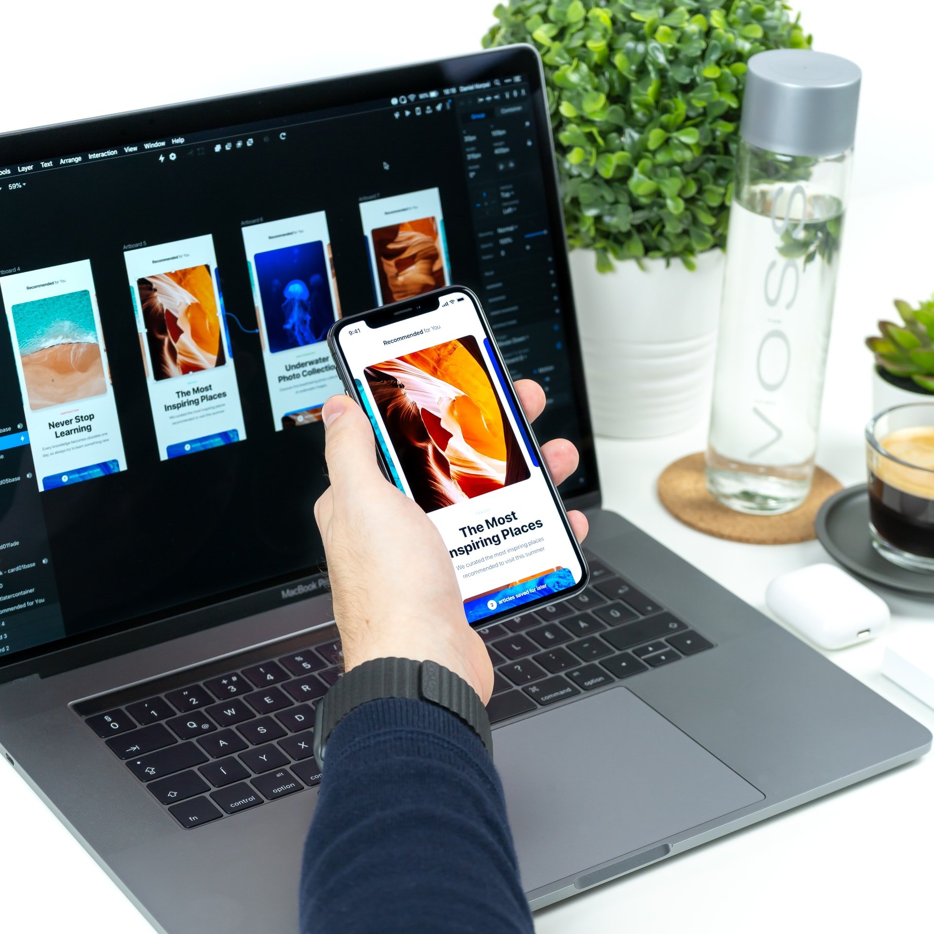
Designing a SaaS app means making hundreds of choices that shape the user experience, but some decisions carry more weight than others. Among the most impactful are your user interface (UI) design choices.
Your UI is more than a collection of buttons and form fields—it’s the first impression users get of your product and a major factor in whether they stick around or churn. When done well, thoughtful UI can drive user satisfaction, retention, and long-term business growth.
But with so many moving pieces, how do you know which UI elements matter most?
In this article, we’ll break down the core UI components that have the biggest influence on SaaS product usability. With practical guidance and real-world considerations, you’ll gain a solid foundation for building a product that looks good, feels intuitive, and keeps users coming back.
TL;DR: What You’ll Learn
UI elements are the building blocks of your SaaS product’s user interface. The individual UX design components, like buttons, form fields, and images, collectively shape your app’s user experience. How you build these UI elements in relation to each other has a big impact on the success of your app or website.
Strategic UI design elements can improve usability and user experience for SaaS apps in particular, where factors like onboarding, subscription actions, and straightforward workflows are critical to retaining users.
Before you get started, familiarize yourself with common UI element names. Understanding UI terminology, including UI component names and examples, goes a long way.
Review our list of the most important UI elements and some examples of each.
→ Learn more: What's the Difference Between UX and UI?
For each of the following UI element names, learn what it is, why it matters, and how to achieve the most success.
What It Is
Typography refers to the text choices and styles you make within your SaaS app interface. This includes font sizes, font faces, and any stylization, such as italics or bolding, that creates emphasis.
Why It Matters
Typography isn’t just aesthetic—it directly affects readability and clarity. SaaS apps rely heavily on copy to guide users, explain features, and prompt action. Clear, consistent typography helps users absorb information faster and feel more confident navigating your product.
Best Practices
A thorough and thoughtful approach to typography includes weighing each of the following text-related factors:
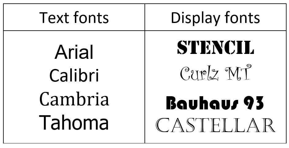
All these elements play a key role in how your content is received. For example, choosing a font like Arial versus a font like Impact conveys a different message about your brand and can affect readability and usability.
A whole site in a bold, blocky font like Impact is hard to read. Switching to a font like Arial for anything other than a header improves readability. The key to success is to use the best font options in the right place.
What It Is
Exactly as the phrase suggests, color scheme refers to the UI design elements that represent your choice of hues and shades of color. Everything from what colors you use to when and how you use them falls within the category of color scheme.
Why It Matters
Color is a crucial part of any UI design because it can significantly impact your users’ impression of your brand. Color can also be used to make your product look more appealing or to direct users’ attention to specific areas on your website.
Best Practices
Color plays an important role in your app's overall mood. The most common UI design color schemes are monochromatic, analogous, and complementary.
The colors you choose will impact the viewer in terms of readability and emotional impact. For example, orange is an exciting color that makes you want to engage more, while red is a warning sign that you must stop and pay attention to. Spend time trying a few different color options to find the one that conveys the right message while remaining practical and readable.
Learn more: How to Use Emotional Design to Create a Great App
What It Is
Navigation elements help users move through your product. These include top nav bars, side menus, breadcrumbs, and internal links.
Why It Matters
Navigation is a crucial part of any UI design, and it’s arguably the most important set of UI controls you can implement on your website or app. If users can’t easily find what they need—or worse, get lost—they’ll bounce. Great navigation keeps users engaged and progressing through their tasks.
Best Practices
Learn more: UI vs. UX: What’s the Difference
What It Is
Buttons are UI controls designed to help users easily navigate your website or mobile app’s overall user experience, whether it be helping them choose between pages or providing a way to interact with the product.
Why It Matters
Buttons are small but mighty. Well-designed buttons guide user behavior and help drive conversions, while poorly designed buttons confuse users or go unnoticed.
Best Practices
What It Is
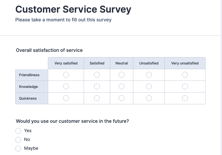
Forms are a method for collecting user information and directing them to the right path or service within the app. If you’re designing UI components for a product that requires a user to sign up or provide information, you’ll need to create a form. A form is a collection of fields that need to be filled out to complete a specific action.
Why It Matters
Forms are where conversion happens. If they’re confusing, too long, or poorly designed, users will abandon them—and your business loses leads or revenue.
Best Practices
What It Is:
Microinteractions are subtle animations or visual cues that provide feedback, like a button ripple, a loading spinner, or a success checkmark.
Why It Matters:
These details humanize your app and guide users through interactions without needing full-blown instructions. They reduce uncertainty, build confidence, and improve perceived polish.
Best Practices:
Even if you have the most creative and visually appealing website or app, your business will never be successful if users get lost or don’t have a clear path to reach their goals. That’s why a good UI design is crucial to your success. Hone in on the user interface elements that drive the biggest impact—typography, color schemes, navigation, buttons, and forms.
Remember, your first design choice isn’t always final. Start with an idea of what you want your users to experience, then spend time on it until it’s right. Try different UI components until you can effectively convey that experience. This takes time and effort, but it is well worth it.
Users judge your company based on its app or website’s UI. We are here to help you develop apps that grow your business, including planning a user interface that matches your desired user experience. Schedule a free consultation to get started.
Explore Designli's UX/UI Design Services →
You might also like:
Subscribe to our newsletter.

Launching a new app? Avoid costly launch delays and ensure a successful app rollout with these 7 essential steps.
It seems as if the terms user interface and user experience pop up together more than they do apart, which makes it easy for many to assume they’re...
.jpg)
In a competitive SaaS landscape, just one misstep can cost you users. Bad UX/UI design is all it takes to send your users running to the competition....
Post
Share