The Hidden Costs of Bad SaaS Design: Why UX/UI Is Non-Negotiable
Bad design leaves money on the table. Don’t believe it? Consider this.

User experience (UX) is at the forefront of everything digital. From digital marketing to social media, companies are focusing on how users experience their platforms now more than ever. The past year has been a particularly good year for UX designers since many companies, even outside the tech industry, are becoming increasingly aware of user experience and have a strong desire to improve their online experience through good UX and UI design.
As with anything, there are UX design trends, some with staying power, some just a one-hit-design-wonder. Here are 10 UX design trends for 2023 that you need to know more about:
One of the biggest problems digital content creators face is getting viewers to easily understand complex information. People want more data that lets them form their own opinions, but they also want that information in an easy-to-understand format. While this can be a challenge, data visualizations like infographics allow designers to deliver complex and technical information quickly and in a way that users better understand.
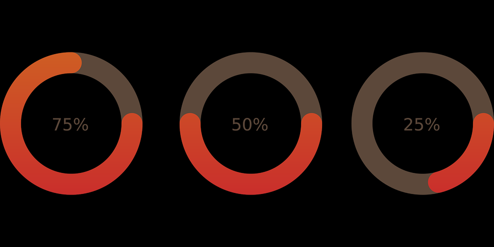
Infographics are often used to help potential customers understand important statistics. They are great for framing information to make it easy to digest and have a much more powerful impact than numbers and figures. For example, an ad for a fancy watch product using the infographic above could say something like this:
A personalized experience simply means that you make adjustments so the experience matches the user’s personal preferences and interests. This is possible in several ways, from changing UI design elements to guiding users toward specific store elements based on what they may be looking for.
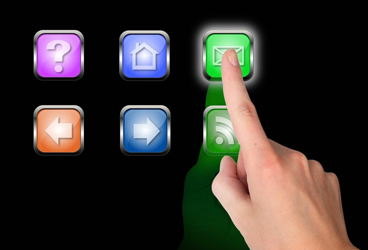
While much of the customization can happen in the background, some UX designers make personalized experiences an integral part of the overall user experience by letting customers make on-screen choices. Not only is this an effective way to gather information, but it also gives the user a sense of ownership over the process. It also increases engagement by engaging the user and letting them have more control over their experience.
The development of responsive color schemes is gaining steam as more operating systems and platforms let online resources automatically customize their user interface to match user preferences. App developers are making their color schemes changeable so that they mostly match whatever system each user already has in place. This makes the app feel like a part of the system the users already have, giving them a more seamless experience.
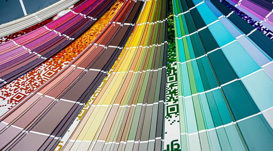
The best example of this is dark mode. Now that it’s becoming more well-known that switching to darker color schemes can reduce eye strain, many apps are developing dark mode to go along with system dark themes. Apps are developing similar color themes to work alongside the system themes for a more seamless experience.
Taking the minimal approach when it comes to design can be better for users in several ways. And while having minimal interfaces is not a new trend, it is still very prominent in 2023. They not only use less data on cell phones, but performance is also much faster, and the interfaces are easier to understand. It’s worth noting that many users prefer the minimalist design as a visual aesthetic, too.
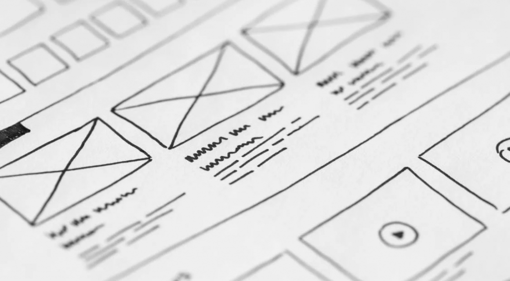
Minimal interfaces are more effective when they focus on one or two important things. It requires effort to slim down your user experience to its most important elements and abandon everything else. However, in doing so, your designs become far more efficient and cleaner as a result.
Augmented reality lets users experience online interactions in real life. This technology is exploding in popularity since it’s not only interesting but useful as well. While many designers are using AR as a game platform, companies are also drawn to it for a variety of reasons, including making it easier for customers to shop.

Pokemon Go is one of the best examples of using AR to engage users. It layers elements of the Pokemon games over real-world locations, and users love the outcome.
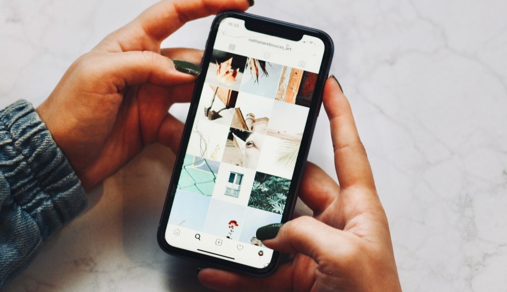
Interactive elements are always a hit with potential customers. UX designers can animate these interactions to tell a story, and this is commonly done with scrolling. Every time a user scrolls, a new animation brings the story to life. Elements fade in, backgrounds move, and users learn more about what they are scrolling through all at the same time.

3D animation is another trend that isn’t necessarily new but is still heavily trending. Rendering techniques and technologies are improving, making it easier to use quality 3D elements in more places. Large 3D renderings are often used on websites with full-screen image backgrounds. This can make a website look more like an interactive movie, which can be a beautiful, immersive experience for users.
No matter which method you choose, telling stories is one of the best UX trends to develop in 2023. In today’s market, it’s no secret that people connect more with stories than they do with products or services. To create a better experience, use your platform to tell a story that easily guides users through the experience.
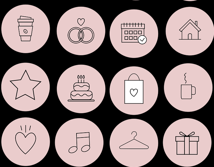
One way UX designers create stories is by developing the different elements of an online platform to tell a story through their use and the way they look. Take a look at the elements above—each one can be used to tell a story, not just because of what they represent, but also how they’re designed. They have an element that’s unique and yet, they are all cohesive to the group.
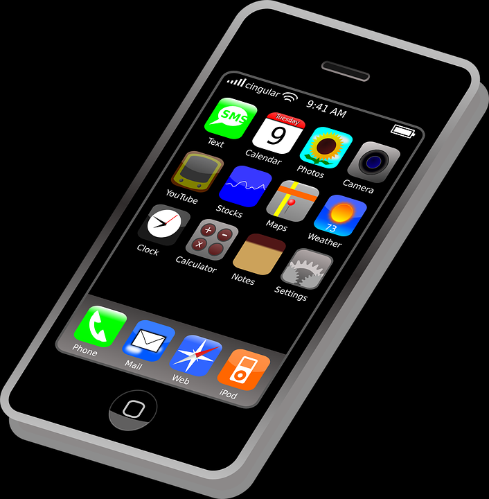
As more people access the internet on mobile devices than they do any other way, designers are prioritizing this audience to have a greater impact. Because of this, responsive designs are slowly fading into the background as designers choose to make their designs for a mobile-first audience. This means choosing to make elements of web design with mobile devices in mind. If 75% of your website traffic is from a mobile device, it just makes sense to cater to that audience over the much smaller portion that’s still using a desktop.
Gamification is a method of adding interactive elements to your designs that let users compete, earn points, or work toward a specific objective. It can be a lot of fun for users to work toward a reward! Gamification can be effective, but only if the process it follows is achievable. You want users to be able to get the rewards—provided they put in the effort.

Interactive designs like gamification significantly increase engagement and long-term relationships, making them one of the best ways to maintain a strong user base. That’s a win-win.
UX trends tend to change every year, but some stick around because they are proven strategies for improving the overall user experience. Start implementing these UX design trends into your next project and see what happens. And as always, we’re here to help!
Explore Designli's UX/UI Design Services →
You might also like:
Subscribe to our newsletter.
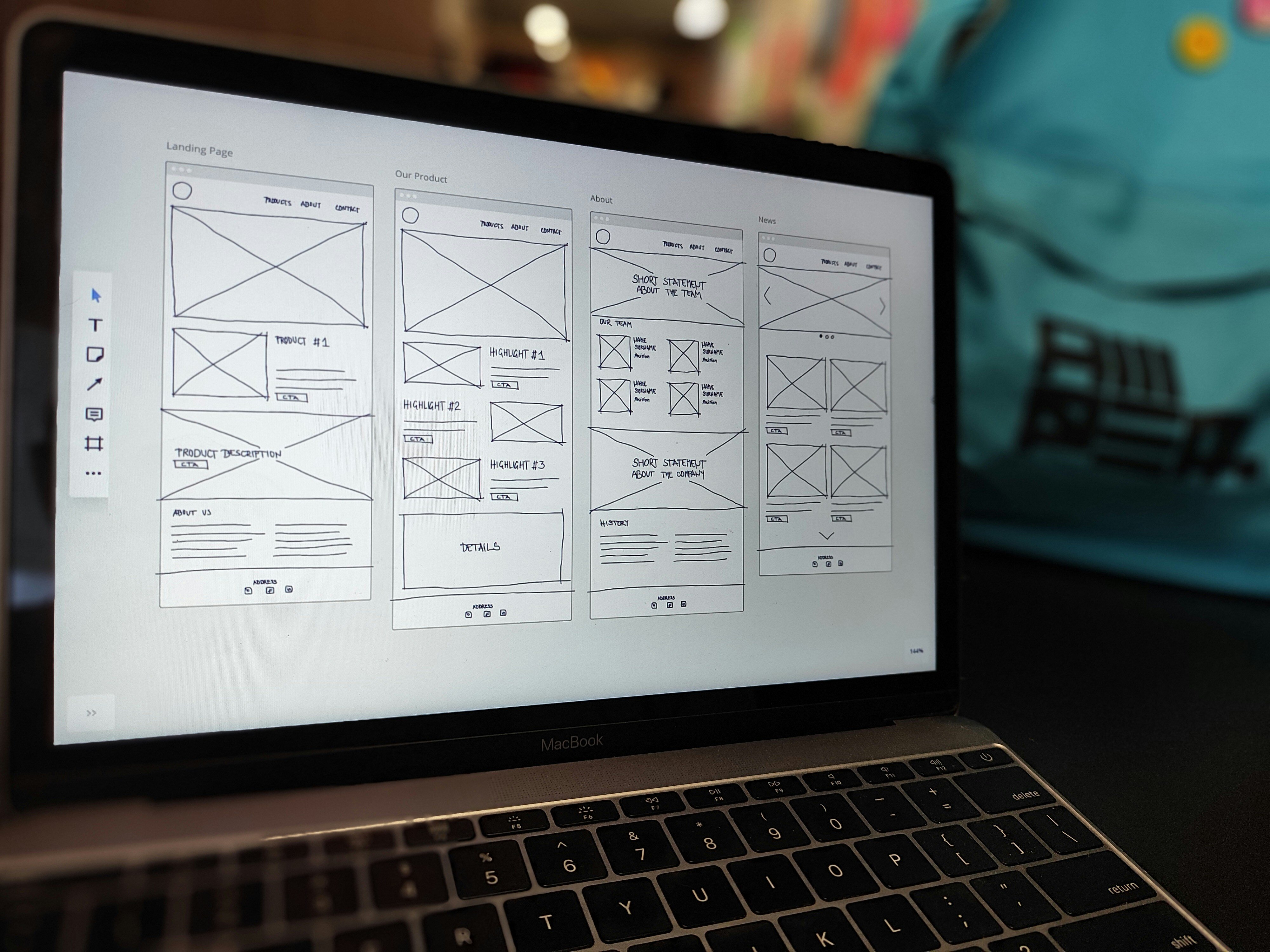
Bad design leaves money on the table. Don’t believe it? Consider this.
It seems as if the terms user interface and user experience pop up together more than they do apart, which makes it easy for many to assume they’re...
Users need to use your mobile app to reap its benefits. It sounds obvious, but user retention often takes a back seat to acquisition, and app...
Post
Share