When to Redesign Your SaaS UX/UI: 5 Warning Signs to Watch For
In a competitive SaaS landscape, just one misstep can cost you users. Bad UX/UI design is all it takes to send your users running to the competition....
3 min read
Written by Katie Iannace, Dec 20, 2022
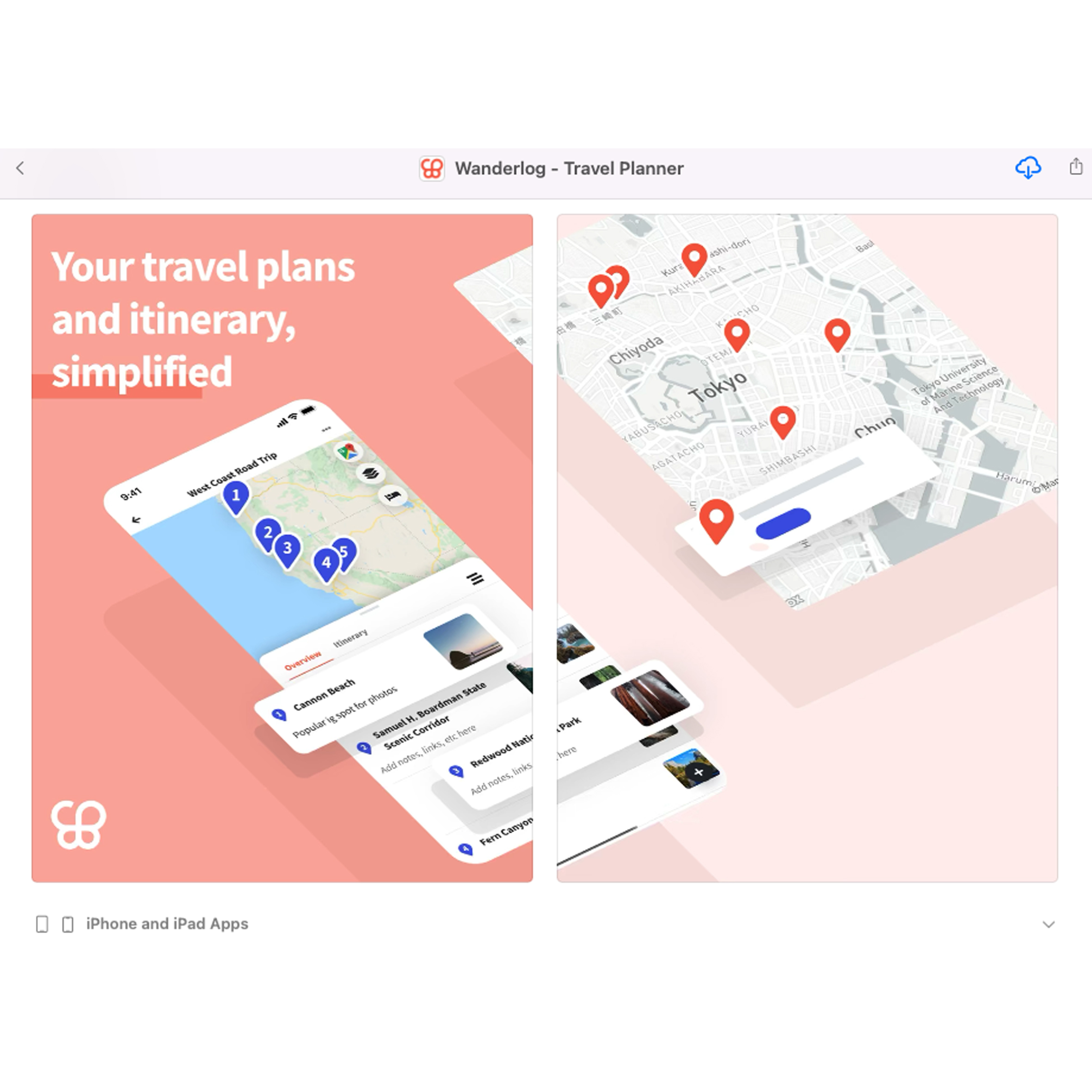
In the “Under the Hood” Series, we look at how popular apps have grown loyal usage through behavioral design. Seeing the techniques in action should give you practical ideas for ways to use behavioral design in your own products.
Identical twin brothers Harry and Peter Xu noticed a persistent problem with travel planning. Even as seasoned travelers, they always found themselves managing a disjointed jumble of Google Docs, email confirmations, receipts, and reservation numbers when preparing for a trip. After speaking to 100 travelers, they confirmed that this wasn’t just a problem they had experienced. Most people had also developed makeshift systems, like spreadsheets or online documents, to keep track of all the moving pieces and collaborate with fellow travelers.
Leveraging previous startup experience at BookWithMatrix, a flight-booking site, and AllTheFlightDeals, a flight deal aggregator, the Xu brothers set out to build an app that would bring all the most important travel details together into a single, easy-to-use interface.
In 2019, the siblings and co-founders launched their company Travelchime and its flagship app Wanderlog. Designed to be as intuitive and simple as Google Docs, the app unites several useful travel tools under one roof. With Wanderlog, users can import reservations from their emails, plan daily itineraries, find suggested hotels, restaurants, and sites; collaborate in real-time with friends, and even track expenses.
In just a few short years since its launch, Wanderlog has demonstrated significant promise and garnered the attention of more than a few raving fans. The company was selected to participate in the Winter 2019 Y Combinator cohort, a prestigious startup accelerator that has funded the likes of Airbnb, Stripe, and Instacart. Wanderlog has also raised more than $1.5 million in funding and reports facilitating thousands of trips every week. Let’s look under the hood now to see how behavioral design principles helped the company achieve this success.
With so many features baked into a single app, it could be easy to create a cluttered and confusing user experience, but Wanderlog does an excellent job of making navigation throughout the app intuitive. This achievement is thanks partly to clean and consistent UI (user interface) design.
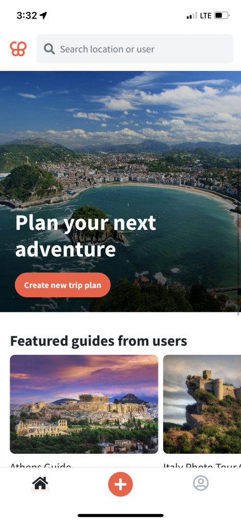
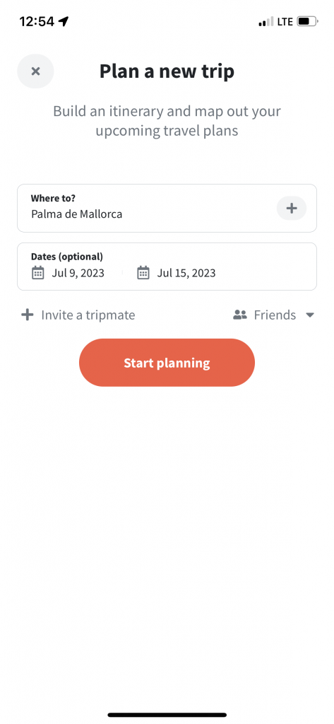
Bright orange buttons with crisp sans-serif font draw the user’s eye to the highest priority action on each screen. Secondary actions are still accessible but less prominent thanks to a muted black-and-white color palette and iconography. Overall, the effect of these design decisions is a stress-free experience for the user. Even if it’s their first time using the app or a particular feature, users can find their way quickly and easily.
Learn more: 5 Most Important UI Design Elements with Examples
Word-of-mouth recommendations have long been considered the holy grail of marketing—and rightly so. According to 2022 research from Nielsen, 42 percent of Americans seek advice from others before making a purchase decision. Influencers, reviews, and trustworthy recommendations can be powerful motivators.
Wanderlog harnesses the power of recommendations by incorporating guides from its community members into the app. The travel guides prompt action among users, encouraging them to move from dreaming about traveling to actually planning a new trip.
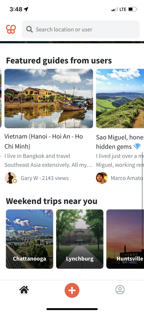
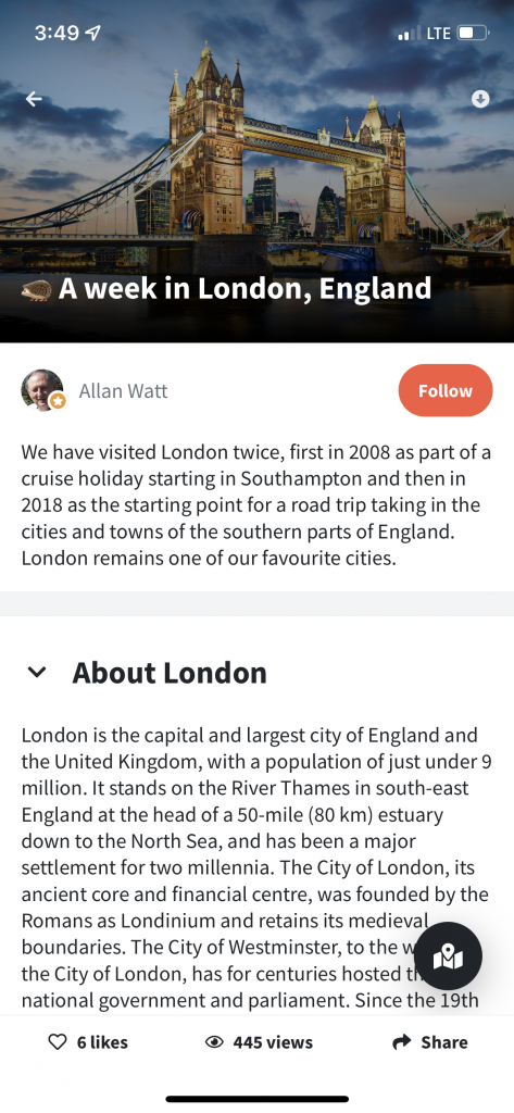
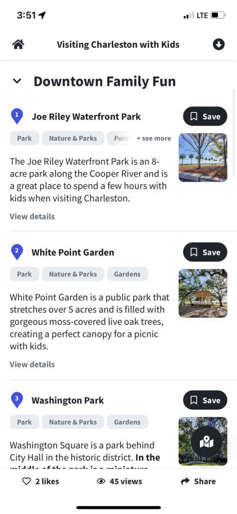
Since any user can create a guide, there’s a feeling of transparency and authenticity about the guides. Smart, subtle design choices, like icons that show likes and views, also add the layer of credibility users need to trust the authors and start planning a trip from their recommendations.
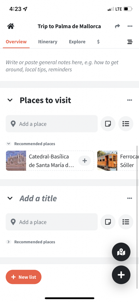
For most people, a blank sheet of paper or an empty spreadsheet can feel daunting. Wanderlog anticipates the discomfort of starting from scratch and eliminates it with sample travel itineraries and easy, tap-to-add suggestions.
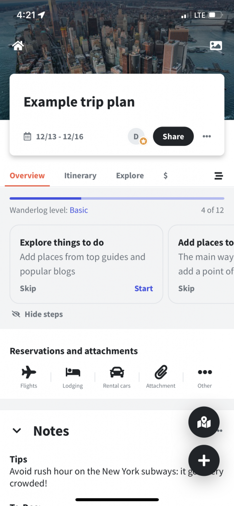
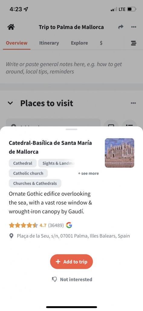
After creating their accounts, users are prompted to browse an example trip plan. This demonstrates the app’s value and creates just the right amount of excitement to nudge users to try it for themselves.
When crafting their own trips, users are supported at every step with location-specific suggestions, like sites to see or restaurants to try, and brief instructions. The app’s designers seem to understand that choosing from a set of options is a lot less intimidating than coming up with something all on your own.
On top of all the other details that prompt user behavior, Wanderlog also uses a visual tracker of progress to encourage users to try out all the trip-planning features available in the app. Each user is assigned a level: Basic, Proficient, or All-star. The tooltips in the app explain that users can advance only by making progress on their trip plan. Once users complete all tasks in the trip plan, they’ll be rewarded with All-star status.
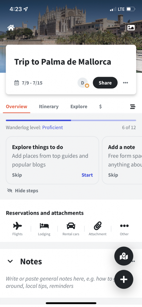
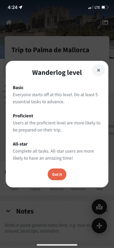
So, whether you’re motivated by someone else’s example or the satisfaction of seeing the progress bar complete, Wanderlog has just what you need to make it to the finish line of your trip-planning process—and enjoy an awesome vacation.
The Wanderlog app makes planning a trip easy, and even fun! The app aims to inspire users to organize their next big adventure, and it’s clear that using behavioral design helps it achieve that goal.
Ready to learn more about how to integrate behavioral design into your project idea? Let’s connect. Reach out to schedule a consultation.
You might also like:
Subscribe to our newsletter.
.jpg)
In a competitive SaaS landscape, just one misstep can cost you users. Bad UX/UI design is all it takes to send your users running to the competition....

There are hundreds—maybe thousands—of decisions between an idea and a full-fledged business application. One of the most important is choosing the...

It seems as if the terms user interface and user experience pop up together more than they do apart, which makes it easy for many to assume they’re...
Post
Share