

User experience (UX) designers are responsible for designing how people interact with digital landscapes. A UX designer creates and carefully maps out every element of a website, mobile app, or application. Because of this, their work is essential in driving the success of businesses that thrive on online applications.
UX design turns first impressions into lasting engagement. It shapes how users navigate, what they understand, and whether they stick around. Great UX leads to better activation, lower churn, and stronger product-market fit. Poor UX? It means silent exits, lost revenue, and frustrated support teams.
And for non-technical founders, UX is often the biggest blind spot. You don’t need to code to build a great product, but you need to understand how people think, feel, and behave inside your app.
This guide breaks down the 9 essential UX principles every founder and designer should know, plus how to apply them in real SaaS product development. Whether you’re building your first MVP or refining a live app, these best practices will help you build experiences users actually want to come back to.
UX Design vs. UI Design: What’s the Difference?
It’s one of the most common points of confusion, especially for non-technical founders.
UX (User Experience) focuses on how a product works:
- Is it intuitive to navigate?
- Can users achieve their goals easily?
- Where do they get stuck, confused, or frustrated?
UI (User Interface), on the other hand, focuses on how a product looks:
- Colors, typography, icons, and layout
- Visual consistency and branding
- Micro-interactions and animations
**UI is the paint. UX is the blueprint.**You can have a beautiful interface that users abandon in seconds or a simple interface that drives engagement because it’s frictionless and clear.
For non-technical SaaS founders without a consulting UX partner, this distinction matters. If your product isn’t gaining traction, redesigning the UI won’t fix it. But UX improvements like faster onboarding, better feedback, or clearer navigation often will.
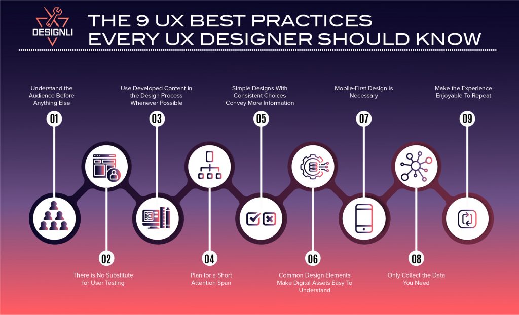
9 UX Best Practices
The following nine principles are practical, battle-tested guidelines that help SaaS teams create better user journeys, especially when you're moving fast with limited resources. Whether you're validating an MVP or refining your onboarding flow, these best practices will keep your product grounded in user needs.
1. Understand the Audience Before Anything Else
The first and arguably most important practice in UX design is determining the audience. Every interaction should be shaped around your user’s goals, context, and constraints.
This means more than guessing personas. It means:
- Interviewing real users
- Mapping out jobs-to-be-done
- Identifying pain points in their current workflow
- Understanding accessibility or device preferences
- Validating what “success” looks like for them
Too many products jump straight into features or UI polish before aligning with the user’s mental model. Resulting in confusion, rework, or even drop-off.
It’s essential to stick to UX best practices to avoid creating a product with UX components that users can’t use easily. Market research will identify the age, income, location, preferences, and other information to help you understand who you are targeting and why. Identifying this information will make the design process much more manageable and successful.
You can also understand your audience by using Loom recordings, lightweight surveys, or even early Figma prototypes to gather feedback and uncover valuable insights.
1.1 Know Your Users = Know Your Use Cases
Don’t just define demographics, map actual workflows. What problem is your user trying to solve daily? Interview them, watch them use competing tools, and align your UX around real tasks.
2. There is No Substitute for User Testing
While many people think testers only use user testing to understand concepts and designs, it’s actually very important in practice for UX. User testing is one of the UX design best practices because user experience testers want to know how a design will perform in the real world.
You can’t improve what you don’t observe. User testing is how you catch friction before it turns into churn. Testing reveals:
-
Where users hesitate or get confused
-
Which steps feel too long or clunky
-
Whether key flows (like onboarding or checkout) actually work
UX designers use user testing to understand how their designs will perform in different situations and uncover potential issues users will run into if the user pathways aren’t optimized. Testing early and often lets you course-correct before wasting development hours on assumptions.
Check out these top remote usability testing tools.
2.1 Test Early, Not Just at Launch
Even if you don’t have a product yet, you can test. Use wireframes or clickable prototypes in tools like Figma or Maze. Ask users to complete simple tasks and observe where they struggle.
3. Use Developed Content in the Design Process Whenever Possible
Starting with the design before writing content can sometimes create potential issues down the road. Many designers tend to design a user interface (UI) using dummy text, leading to problems when inserting the final text later.
One way to ensure a good user experience with no hiccups is to create the written content before starting on the overall interface. This should be straightforward since you will already know your target audience and what interests them, so you have everything you need to develop compelling content.
Designing with placeholder text might feel faster, but it often leads to bad assumptions and awkward layouts.
Real content shapes real experience. It affects:
- How users scan and navigate
- Whether CTAs feel clear and persuasive
- How much space design elements actually need
When you start with real or at least draft content, your layout adapts to meaning, not filler. This results in interfaces that feel more intuitive, trustworthy, and human.
Learn more about the differences between UI and UX.
3.1 Write First, Then Design
Content-first design works especially well in SaaS. Write out empty-state messages, error copy, and tooltips before designing screens; it ensures clarity and reduces back-and-forth later.
4. Plan for a Short Attention Span
Today’s users don’t browse; they glance, skim, and decide in seconds. Especially in SaaS, where users typically have a goal in mind (track a KPI, check a task, send a report), friction kills momentum.
That’s why great UX is built around clarity and speed.
To keep users engaged:
- Use purposeful text; no one reads dense paragraphs in-app.
- Break content into clear sections with scannable headers and bullet points.
- Put key actions above the fold, don’t make users hunt for buttons.
- Leverage visual hierarchy to guide attention with contrast, size, and spacing.
The goal is total focus. Every second of ambiguity is a chance for users to bounce or get frustrated.
This is important because if you allow the user to get lost in what they are reading, they will be more likely to leave your website or app before taking the actions you ultimately desire them to take. They are there for a specific purpose, so if you fail to give them what they need, they will not stay.
After designing a new screen, ask yourself: Can a new user understand what the screen is for and what they should do next in under 5 seconds? If not, cut or rework.
4.1 Simplify Key Flows
For actions like onboarding, upgrading, or completing tasks, reduce steps and cognitive load. Use autofill, pre-populated defaults, and visual progress indicators to speed things up.
5. Simple Designs With Consistent Choices Convey More Information
Simplicity is about removing friction, so users can act without thinking twice. Consistency reduces cognitive load. When every screen follows the same patterns, users feel confident, not confused. That’s critical for activation, retention, and long-term trust.
How to apply it:
- Reuse patterns for buttons, navigation, modals, and alerts
- Limit your color and type palette
- Make one primary action obvious per screen
- Don’t reinvent familiar UX, like checkouts, onboarding, or tab bars
The fewer surprises, the faster users move, and the more likely they are to complete key actions. This consistency creates familiarity and motivates users to keep coming back and repeating the steps.
5.1 Be Consistent, Especially in Navigation
Users don’t want to relearn patterns across screens. Use consistent layouts, button labels, and component behaviors (e.g., always placing the “Save” button bottom-right).
6. Common Design Elements Make Digital Assets Easy To Understand
Common design elements are popular because they work. These elements put everything users need at the tips of their fingers, making it easy to find and understand what is going on at any given time. The number of common design elements used in a mobile app interface correlates with the app’s overall user experience.
Good UX should never confuse users. It should only provide reassurance. When users recognize common patterns like toggles, breadcrumbs, hamburger menus, or modals, they can interact without hesitation. That familiarity builds momentum, trust, and efficiency.
Instead of reinventing the wheel, lean into established UI conventions:
- Use recognizable icons (e.g., trash can for delete, magnifying glass for search)
- Stick to standard navigation behaviors
- Don’t bury expected elements like the login button or support links
- Mirror UX patterns from successful apps your users likely know
Familiarity breeds usability. It lowers the learning curve and makes your product feel natural, especially for new users. Study tools your users already use. Are they using Slack, Notion, Stripe, or Shopify? Borrow interaction patterns they’ll already understand.
6.1 Familiar = Faster
Lean on common SaaS UX patterns; you don’t need to reinvent every UI control, save innovation for your core features.
7. Mobile-First Design is Necessary
Most users experience your product on a small screen, especially if your app serves busy professionals, consumers, or emerging markets. If the mobile experience feels clunky or confusing, you’ve already lost them. That’s why mobile-first design shouldn't be treated as a trend.
Start by designing for the smallest screen first, then scale up. This forces clarity and constraint, which improves UX across every device.
Mobile-first UX means:
- Prioritizing one primary action per screen
- Using clear, tap-friendly buttons
- Minimizing the need for typing or pinching
- Testing actual flows on real devices, not just in Figma
A great mobile experience starts with understanding what matters most and building from there.
Open your product on your phone and try completing a core task (like sign-up, creating something, or accessing data). If it feels cramped or frustrating, users will feel it too.
7.1 Start Mobile-First
Mobile-first isn’t just about layout, it’s about prioritizing essential actions and feedback. Especially if your users interact on the go (think sales reps, field workers), design accordingly.
8. Only Collect the Data You Need
Just because you can ask for more information doesn’t mean you should. Every extra field, permission request, or data input increases user friction and gives them another reason to bounce. Especially in SaaS onboarding, asking for too much up front can feel invasive or unnecessary.
Instead, follow a just-in-time approach to data collection:
- Ask only what’s essential to get the user started
- Collect additional info gradually, as it becomes relevant
- Be transparent about how and why you’re using their data
Not only does this improve UX, but it also reduces privacy concerns and builds trust, a key factor in long-term user retention.
Here are the most important App KPIs to measure.
8.1 Be Transparent About Data
Only ask for what’s necessary and show users why. Explain data fields inline, offer privacy settings, and avoid form bloat.
9. Make the Experience Enjoyable To Repeat
You should keep in mind that you are creating a product for someone to enjoy from the beginning of the design process. After all, your app should solve a problem for your audience and make their lives better in some way. In SaaS, long-term success depends on repeat engagement. Your product should feel not just useful, but rewarding to use again and again. That means creating smooth workflows, reinforcing progress, and giving users a reason to return.
What makes an experience enjoyable to repeat?
- Clear value delivery: Users should see immediate benefit from key actions.
- Positive reinforcement: Use small wins, milestones, or personalized feedback to reward progress.
- Predictable and stable flows: Avoid surprises or friction during everyday use.
- Evolving utility: Show users how the product grows more valuable as they continue to use it.
When it comes to development, design for long-term habits, think beyond the first session. You get exponentially more out of having users come back repeatedly, so you want your experience to be satisfying, effective, and reliable.
9.1 Build Habits, Not Just Features
Encourage daily or weekly engagement. This could happen through notifications, personalized dashboards, or streaks; just ensure it aligns with actual user goals.
Here’s a table summarizing the 9 UX Best Practices Every UX Designer Should Know:
| Practice | What It Means | Why It Matters |
|---|---|---|
| Understand the Audience Before Anything Else | Use research to define user needs, behaviors, and expectations. | Aligns the product with actual user goals, not assumptions. |
| There is No Substitute for User Testing | Validate design decisions through usability testing. | Reduces rework by surfacing issues early. |
| Use Developed Content in the Design Process Whenever Possible | Design with actual (or close to final) copy, not lorem ipsum. | Prevents layout/content mismatches and improves message clarity. |
| Design for Short Attention Spans | Break content into scannable, engaging sections. | Keeps users engaged and reduces bounce or abandonment. |
| Keep It Simple and Consistent | Limit friction with minimal, repeatable interface patterns. | Supports intuitive use and faster decision-making. |
| Use Familiar UI Patterns | Include standard elements (e.g., toggles, menus, breadcrumbs). | Improves learnability and user confidence. |
| Prioritize Mobile-First Design | Start design thinking from small screens upward. | Ensures usability across the most-used devices. |
| Collect Only Necessary Data | Avoid over-asking in forms and permissions. | Builds trust and keeps interactions lightweight. |
| Make It Worth Repeating | Create enjoyable, habit-forming experiences. | Drives retention, loyalty, and referral over time. |
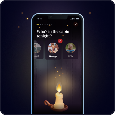
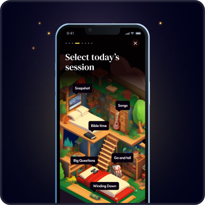
How Designli Applied UX Best Practices to Cabin Time
Client:
Cabin Time: a spiritual camp scheduling app funded by a grant.
Challenge:
A tight timeline and strict budget made it critical to launch only what mattered most to users — campers and their parents.
Solution:
Through our SolutionLab, we conducted user interviews and used an Impact vs. Effort Matrix to prioritize features. This allowed us to:
- Focus on visceral design (like a “campy” visual theme to build trust with parents).
- Design a seamless onboarding flow for both age groups (behavioral).
- Validate that the MVP aligned with the app’s core mission and could scale later (reflective).
Outcome:
Cabin Time launched on schedule with only the most valuable UX flows, a strategy that ensured engagement from day one.
The Designli Approach: UX That Grows With Your Product
At Designli, we correctly apply UX principles and build scalable product experiences around them. Our process supports both early-stage SaaS teams and mature products looking to level up usability and retention.
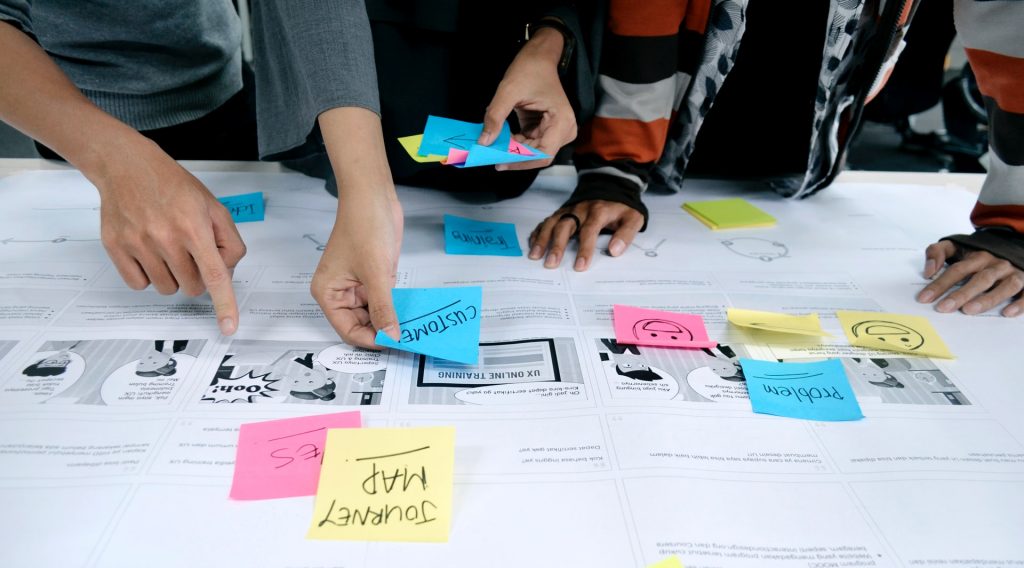
SolutionLab: Strategy Before Screens
Before design begins, we lead clients through SolutionLab, a structured 2-week workshop where we develop a fully functional interactive prototype and help you clarify:
- User goals and frustrations
- Business objectives
- Key UX flows to prioritize
This sets the foundation for intentional design choices that serve your users and your growth goals, especially if you don’t have an in-house design lead.
The Designli Engine: Lean, Scalable UX Execution
The Designli Engine automates the initial backend codebase, including standard functionalities and database creation. It establishes the database, core services, and structural patterns your team will build on, all written specifically for your application and owned entirely by you. Launching a scalable, real-world MVP based on clean architecture, and the UX best practices applied.
Hypothesis-Driven Development (HDD): Iterate With Insight
Design doesn’t end at launch. We use Hypothesis-Driven Development (HDD) to:
- Prioritize UX changes based on measurable impact
- Track success through real user behavior
- Eliminate guesswork in roadmap planning
You don’t need to guess what users want, you can prove it with data, refine your experience, and grow with clarity.
FAQs
1. What are the most important UX principles for startups?
The most critical UX principles for early-stage SaaS companies are:
- Knowing your audience
- Testing early with real users
- Prioritizing simplicity and consistency
- Designing mobile-first
- Building experiences worth repeating
These practices help startups reduce churn, build trust, and validate product direction before scaling.
2. How is UX design different from UI design?
UX (User Experience) is about how a product works, while UI (User Interface) is about how it looks.
- UX focuses on structure, flow, and usability
- UI focuses on visual styling and interaction details
Think of UX as the blueprint, and UI as the interior design.
3. When should a company hire a UX consultant?
A company should consider UX consulting when:
- Users aren’t converting or retaining
- You’re planning a redesign, but don’t know where to start
- Your product roadmap feels disconnected from user needs
- You’re launching a new feature or product and want to validate usability before development
Working With Partners Makes UX Design Even Better
Great UX is about guiding your users toward success, building trust at every step, and reducing the friction that kills growth. For SaaS products, especially, user experience is often the deciding factor between steady traction and silent churn. It’s not a “nice to have,” it’s the engine behind activation, retention, and long-term loyalty.
Whether you're designing your first MVP or improving an existing product, these 9 UX principles give you a foundation to make smarter, more strategic decisions, even if you’re not a designer.
And if you're looking for a partner to help you bring these UX best practices to life, that’s where we come in. Schedule a consultation.
Let’s build an experience your users actually want to come back to. Explore Designli's UX/UI Design Services →
You might also like:


