

Your app isn’t just what it does; it’s how it feels. In SaaS, features get attention. UX/UI determines whether those features get used. A product can solve a real problem and still fail if the experience feels confusing, overwhelming, or inconsistent. Users don’t separate functionality from design; to them, the experience is the product.
That’s why UX/UI is one of the most direct expressions of your business strategy. Every interaction, every screen, and every moment of friction or clarity influences activation, retention, support costs, and long-term trust. A confusing onboarding flow slows growth. A cluttered dashboard increases churn. Poor accessibility shrinks your reachable market. Design decisions are business decisions.
This article explores how strategic UX/UI drives real outcomes, from aligning interface design with your brand and product strategy to optimizing onboarding, accessibility, microinteractions, and scalability. We’ll also examine where AI-generated interfaces fall short and what mature, growth-ready UX systems look like in practice.
Aligning UI with Your Business and Product Strategy
Your brand doesn’t live only on your homepage or in your pitch deck; it lives inside your product.
Color choices, typography, spacing, copy, and interaction patterns all reinforce positioning. A fintech app designed for enterprise CFOs should not feel playful or experimental. A wellness app designed for young adults shouldn’t feel rigid or corporate. The interface signals maturity, confidence, speed, empathy, or authority long before users a single word.
Every visual and behavioral decision communicates something:
-
Bold contrast and sharp edges can signal confidence and precision.
-
Soft palettes and generous whitespace can signal calm and care.
-
Dense dashboards may signal power or overwhelm, depending on the audience.
If the interface feels disconnected from your brand promise, trust erodes. Alignment creates coherence, and coherence builds credibility.
Strategic Design Builds Clarity and Trust
Strategic design goes beyond making things look better. It reduces cognitive load and makes decisions easier. Clear labels, logical information hierarchy, and consistent patterns remove ambiguity and eliminate unnecessary friction. Users should never have to guess what to click or where to go next.
Predictable flows reduce anxiety. When interactions behave consistently, buttons respond clearly, confirmations appear at the right time, and progress indicators explain what is happening. As a result, users feel in control.
Emotional intelligence deepens connection. A billing confirmation should feel reassuring. An error message should feel helpful, not alarming. A first-time setup flow should guide rather than overwhelm.
Design that anticipates emotional reactions builds confidence, and confidence is what keeps people coming back.
Source: Visily
Designing for Emotional Context
Some products operate in emotionally sensitive environments. In those cases, UX strategy must account for emotional reality, not just usability best practices.
Consider an app designed to support people navigating grief. The interface cannot be loud, gamified, or overly stimulating. It needs:
-
Calm, muted colors
-
Clear but gentle language
-
Minimal distractions
-
Straightforward navigation
The goal is not aesthetic minimalism. It is emotional appropriateness. Users in vulnerable states need clarity without pressure and guidance without noise.
In these contexts, UX decisions become strategic. The interface should reflect the user’s emotional condition while still delivering functionality. That balance between empathy and usability is what distinguishes surface-level design from truly strategic UX.
Onboarding UX: Where Trust Is Won or Lost
Far from being just a tutorial, onboarding is the moment your product proves its value or fails to.
Most churn in SaaS doesn’t happen because the product is bad. It happens because users never reach value. These interactions are where value must become visible, tangible, and immediate.
Onboarding as Value Acceleration
The goal of onboarding isn’t to explain every feature but to create momentum. Users are not seeking a product tour; they just want progress.
Instead of walking people through every button, strong onboarding should:
-
Get them to a meaningful outcome fast
-
Remove unnecessary setup steps
-
Personalize early inputs where possible
-
Show progress clearly
A project management tool shouldn’t explain its tagging system first. It should help the user create a task. A budgeting app shouldn’t describe analytics. It should show a snapshot of spending. A well-structured onboarding process builds belief, and that belief builds retention.
Complex Apps Must Balance Security and Simplicity
In industries like crypto, banking, or healthcare, onboarding becomes more delicate. In these cases, the process will be more detailed and potentially longer.
You need:
-
Identity verification
-
Security steps
-
Legal disclosures
-
Permissions
As every additional requirement adds friction, the challenge for this type of app is sequencing security intelligently and fluently. Structure it into related groups, explain why information is needed, and provide clear visual feedback so users know they’re progressing.
Security without clarity feels intimidating and creates doubt. Security with transparency feels responsible. Users will tolerate friction if they understand its purpose.
Dashboard Clarity = User Confidence
After onboarding, the dashboard becomes the anchor. The first screen users see after signing in should answer three questions immediately:
-
Where am I?
-
What can I do here?
-
What should I do next?
Clear hierarchy, logical grouping, and restrained visual noise are critical. If users have to scan excessively, hover randomly, or guess what a metric means, confidence drops.
Practical Rule: “Test It With Your Grandparents”
A simple rule of thumb: if you have to explain how to use your onboarding flow, it needs redesign. Most users are not inexperienced. If they struggle, the issue usually lies in the interface. Onboarding should be intuitive enough to guide people without additional explanation.
If someone outside your industry can sign up, complete setup, and reach initial value without guidance, you are close to getting it right. Onboarding is where trust begins: when users feel competent and guided from the start, they are far more likely to stay long enough to experience the full value of your product.
Microinteractions: Small Details, Major Impact
Microinteractions are the quiet signals that make an interface feel responsive and alive. They’re not the headline features of your app; they shape how users perceive every interaction.
What Microinteractions Actually Do
Microinteractions are the subtle responses that happen when users take action.
They can include:
-
Tap or click feedback
-
Scroll state changes
-
Loading indicators
-
Button hover effects
-
Confirmation animations
Think about Instagram for a moment: when you pull down to refresh your feed, the motion feels elastic and intentional. When you double-tap a photo, the heart animation appears instantly. When a message is sent in DMs, you get immediate confirmation. Those are microinteractions.
These small signals tell users, “We heard you.” Without them, interfaces feel broken, even if they technically work.
They Reduce Cognitive Load
One of the biggest causes of frustration in digital products is uncertainty.
Did the button work?
Is the system loading?
Did my message send?
Microinteractions eliminate that uncertainty. Clear system feedback lowers mental effort because users don’t have to guess what’s happening behind the scenes.
A subtle animation when a task is completed reinforces progress. A temporary toast notification confirms success. A disabled button state prevents errors before they happen. Microinteractions have the power to reduce doubts and eliminate friction.
They Build Perceived Quality
Users rarely comment on microinteractions directly. But they absolutely feel their absence.
Examples most people recognize:
-
Pull-to-refresh interactions in mobile apps
-
A “Message sent” confirmation
-
Smooth swipe gestures
-
Subtle animation between screen transitions
These details communicate craftsmanship. They signal that the product is considered intentional and reliable. Microinteractions strengthen existing functionalities; they are rarely noticed consciously, but they are deeply felt.
And in competitive SaaS markets, that feeling can be the difference between “good enough” and “I trust this.”
Accessibility Is Growth, Risk Management, and Reach
Accessibility is often treated as a checklist item. In reality, it’s a strategic decision that affects growth, compliance, and long-term brand trust. If your product doesn’t work for everyone, it doesn’t work.
UX Isn’t Inclusive Unless It Works for Everyone
Users experience your product in very different ways.
Colorblind users → cannot distinguish certain interface cues.
Low-vision users → rely on larger text or screen magnification.
Keyboard users → navigate using keyboards instead of a mouse.
Assistive technology users → use technologies like screen readers.
Accessibility is not a niche concern. It is about designing for real people with real constraints: visual, cognitive, physical, or situational. When accessibility is overlooked, friction does more than frustrate; it excludes.
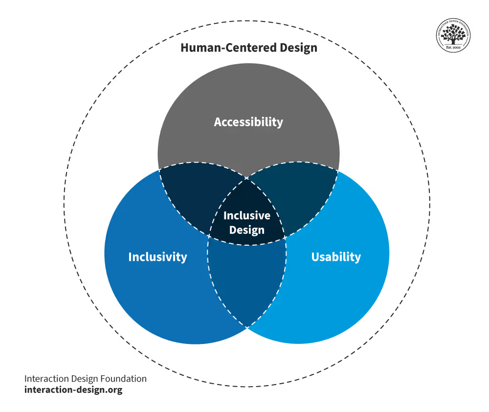
Source: Interaction Design Foundation
Foundational Accessibility Practices
Strong accessibility requires discipline throughout the whole design process, aiming to anticipate any needs. Some accessibility practices you must include are:
-
Proper contrast ratios so text is readable
-
Scalable typography that adjusts across devices
-
Clear focus states for keyboard navigation
-
Semantic HTML and ARIA tags for screen readers
-
Alignment with WCAG 2.1 guidelines
These practices create structure. They make your product usable in more contexts, not fewer. And, importantly, they force clarity. Accessible design often improves usability for everyone, not just users with specific needs.
Why Accessibility Matters Strategically
Accessibility is a strategic advantage. It expands your total addressable market, reduces support tickets through clearer interfaces, and strengthens brand trust by signaling responsibility and maturity. As digital accessibility standards tighten across industries, it also reduces compliance risk.
Accessibility functions as infrastructure. Like any foundational decision, it is far more cost-effective to design it properly from the start than to retrofit it later.
“Accessibility isn’t a feature you toggle on at the end; it’s architecture. If you don’t treat it as a priority constraint from day one, you’re not just creating UX debt; you’re creating business risk. Build it into the system, and you expand reach, reduce friction, and many more benefits.”
— José Guillen, Full-Stack Technical Lead
Why AI-Generated UI Often Fails the Strategy Test
AI tools have made it incredibly easy to generate interfaces in minutes. Entire apps can now be “vibe-coded” from prompts. Speed isn’t the problem yet; lack of strategy is.
The Rise of “Vibe-Coded” Interfaces
These interfaces are often:
-
Fast to produce
-
Visually polished at first glance
-
Template-heavy
-
Structurally repetitive
-
Emotionally shallow
They look complete but rarely feel intentional. You can usually tell when an app was assembled from generic components versus designed around a specific user journey. The difference shows up in hierarchy, spacing, flow logic, and how the interface responds to edge cases.
There’s a reason people say, quietly, “You can tell who hired a designer… and who didn’t.”
AI Tools Don’t Ask Strategic Questions
AI can generate layouts, but it isn’t capable of answering or intuitively understanding the kinds of questions that clarify a product roadmap. Questions such as:
-
Who is the user?
-
What emotional state are they in?
-
What friction matters most?
-
What action should feel obvious here?
-
What moment requires reassurance instead of speed?
Those are business questions. And they shape the experience more than any template ever will.
No-Code Is a Tool, Not a Strategy
No-code and AI platforms are powerful when used intentionally; when used blindly, they can be dangerous.
Used with clear product thinking → they accelerate execution.
Used without strategy → they create forgettable, fragile products.
You can use every AI tool available, but someone still needs to define the architecture, maintain performance, handle security and scalability, enforce design consistency, and manage technical debt. These responsibilities require experienced engineers and designers who understand systems, tradeoffs, and long-term implications.
AI can accelerate execution, but it does not replace design thinking or technical oversight.
**“**Great products are shaped by designers who obsess over user experience, UI/UX specialists who refine clarity and usability, and developers who think beyond features toward systems, scalability, and long-term maintainability.
AI accelerates execution and increases development speed, but it does not replace professionals who understand system architecture, tradeoffs, scalability constraints, and how thoughtful product experiences translate into sustainable long-term business value.****”
— José Guillen, Full-Stack Technical Lead
What Mature UX/UI Looks Like in Practice
Strategic design becomes visible in consistency. At scale, mature UX/UI feels stable and deliberate. It does not demand attention; it earns trust through predictability and restraint.
The Google Standard
Look at products like Gmail, Google Drive, or Google Admin. They serve different audiences and solve different problems. Yet they share:
-
Predictable interaction patterns
-
Consistent layout logic
-
Familiar navigation structures
-
Unified visual language across products
It all works cohesively; buttons behave the same way, feedback feels consistent, and system states are clear. Even when features are complex, the structure rarely surprises you. Gmail, Drive, and Admin don’t feel like separate tools built by disconnected teams. They feel like parts of one coherent system.
That coherence is not accidental. It’s the result of strong design systems, strict component logic, and disciplined UX governance.
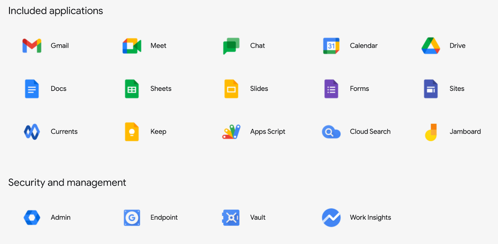
Source: Jatheon
Why It Works
Trust grows from familiarity. When users do not have to relearn how things work, cognitive load decreases and confidence increases.
Google’s products demonstrate this well. They handle significant complexity without overwhelming the interface. Advanced features are available, but they stay in the background. Core actions remain clear and easy to find.
Consistent feedback loops reinforce trust:
-
Loading states are clear
-
Errors are understandable
-
Confirmations are immediate
-
System changes are visible
At this level, nothing should feel ambiguous; great UX becomes almost invisible. Users rarely notice the design itself. Instead, they experience clarity and momentum.
They don’t think, “This interface is well designed.” They think, “This just works.”
Building Scalable UX/UI for SaaS Growth
As products grow, design either becomes an asset or a liability. Scalable UX/UI ensures that adding new features doesn’t create confusion, inconsistency, or design debt.
Simple ≠ Basic
There is a common misconception that “simple” means stripped-down or minimal. In practice, simplicity means users can complete tasks quickly, understand what to do next without hesitation, and rely on a system that remains adaptable as features expand. A scalable interface does not remove power; it makes complexity manageable by structuring it in a way that feels intuitive and controlled.
Systems Thinking
Scalability requires moving beyond one-off screens and adopting systems thinking. Instead of designing features in isolation, teams build structured foundations that support long-term consistency and growth.
This includes defining design tokens, standardized colors, typography, and spacing values. Creating reusable components such as buttons, cards, forms, and modals; enforcing consistent spacing rules; and maintaining unified interaction patterns across the product.
Instead of redesigning elements every time, teams build from a shared foundation. This reduces visual drift and prevents inconsistencies as new features roll out.
Strong scalable UX relies on three pillars:
-
Simplicity → clarity over cleverness
-
Functionality → every element has a purpose
-
Consistency → predictable patterns across the system
If one of these breaks, the scale starts to feel messy.
“When you think in systems, you stop designing features in isolation and start building foundations: tokens, components, interaction patterns, and spacing rules that scale without visual drift.”— José Guillen Full-Stack Technical Lead
The Designli Approach: Strategic UX From Day One
At Designli, we apply these principles because effective UX/UI comes from structure, not improvisation. Strategy, accessibility, onboarding clarity, scalability, and technical alignment are not separate conversations. They operate within a single, disciplined development approach.
Strategic UX starts with alignment between design and goals. For founders with an existing product, Impact Week helps diagnose friction across onboarding, hierarchy, accessibility, and system consistency before jumping into redesigns. Many interface issues are symptoms of deeper structural problems. We address those first.
For new products, the SolutionLab translates business strategy into a structured experience. We map user goals to business logic, define core value moments, establish scalable design patterns, and validate decisions through a clickable prototype before development begins.
Once in development, UX and engineering move together. Design systems are maintained, accessibility is implemented correctly, performance is protected, and architecture supports long-term growth. Our team uses AI as a real-time pair programmer and leverages automation tools that supercharge velocity without sacrificing quality
From early code audit to full build, the focus remains the same: interfaces that reinforce trust, reduce friction, and scale without design chaos.
Strategic UX Is a Competitive Advantage
UX/UI is not a finishing touch. It is the system through which strategy becomes tangible. Onboarding decisions influence activation, microinteractions shape trust, and accessibility choices quietly determine who can participate. Even the structure of a design system affects whether a product scales with clarity or slowly drifts into inconsistency.
When design is treated as decoration, the consequences tend to surface later in churn, confusion, and expensive rework. When it is approached as infrastructure, the product feels deliberate. It behaves predictably. It earns confidence over time.
What ultimately separates strong products from forgettable ones is alignment. When business goals, user psychology, technical architecture, and interface clarity reinforce one another, the result goes beyond visual polish. It creates a product people understand, trust, and return to without hesitation. If you want to elevate your UX practices through a structured and intentional approach, schedule a free consultation.
You might also like:


