4 Steps to Create a User Flow Diagram
Your users should be at the forefront of your design process. If a user can’t achieve what they want to on your website or app, they will go...

Building an app is so much more than interface design and feature prioritization (though those choices matter!) You also must consider the way a user moves through the app. What happens if a user taps this button—then what? Or perhaps a user opens this menu instead—then what? If you’re starting to see a choose-your-own-adventure-style decision tree in your head, you’re on the right track.
In the world of app development, those maps of user decisions are called user flow. A user flow is the foundation of every successful app. Even though non-developers rarely consider them, user flows are an essential step in the development process.
An app user flow diagram lays out the path a user might take as they travel between screens or individual features on an app. Architecting an efficient user flow can make or break an app.
In this guide, we’ll unpack everything you need to know about app user flows. We’ll define what a user flow is (and isn’t), explore the steps to design an effective user flow, and share tips for implementing and testing your user flows.
A user flow is like a map of your app. It paints a picture of users’ progressions through the app, from where they start to where they complete a goal and every step in between. User flows capture every step to achieve a desired outcome, like making a purchase or submitting a form.
To understand a user flow, consider this example from a clothes-shopping app:
Designing a user flow for a new app is like a city planner mapping out roads for a new town. Some roads go from point A to point B. Some roads are one-way streets, and some roads cut through downtown, while others don’t. Just as real people will drive on those real roads to navigate the town someday, real users will take the pathways defined by a user flow. That’s why it’s so important to define clear user flows. These app user flows form the foundational structure of an app, so they must be designed to support intuitive and efficient user movement.
The most important quality of an effective app user flow is clarity. User flow diagrams shouldn’t be one giant tangle of arrows and pathways exploding from the home screen. That would be overwhelming. Instead, follow these tips:
The terms “user flow” and “user journey” are often used interchangeably. However, there is a nuanced difference between the two. Though both depict user pathways through an app, a user journey also considers users’ feelings and thoughts at each step along the way. A user journey focuses less on assigning context to the way screens and features relate and more on graphing a user’s interactions alongside their emotions.
For example, a user journey about the audio-streaming app Spotify would offer a segmented high-level overview of the user’s actions and sentiments while navigating the app.
A user flow for the same process would be more specific, describing screen-by-screen what a user sees. The user logs in for the first time and then makes a choice from a list of available features, like a search bar, a folder of favorite artists, and a “recommended for you” browse button. The Spotify app user flow would then answer questions like “From the browse new music screen, what does the user click next if they want to play music?”
User journeys can help identify potential pain points and negative user experiences. So, while they’re different from user flows, they’re an important tool in a developer’s toolkit.
A clear visual representation of user flow is critical for app success. Here’s why:
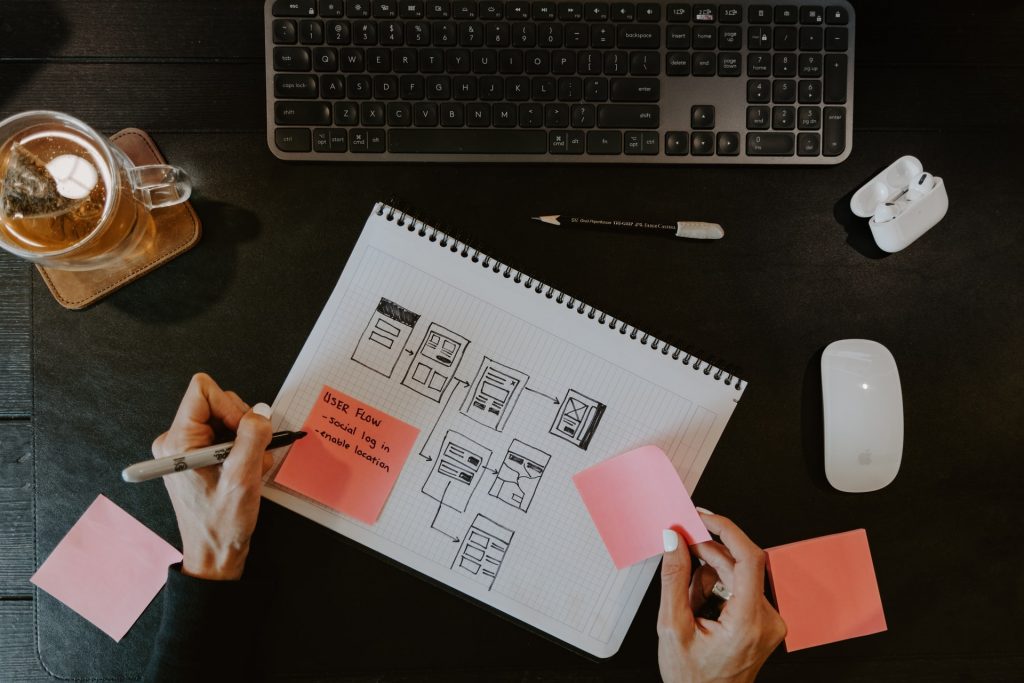
After user flows establish what a user’s needs are and how they would go about achieving goals within an app, wireframes can take these ideas a step further. Typically, user flows are made before wireframes, but these two elements of app development go hand-in-hand.
Wireframes act as sketches of different ways an app screen might look and how one screen design leads users to another. This process follows the path established by the app user flow. It builds on the existing path, showing what the home screen would look like, for example, if a user navigated from it to their inbox via a static menu, a button, or some other way.
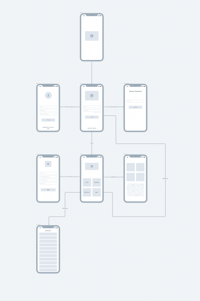
“Wireflows” are a hybrid of user flows and wireframes. In a wireflow, the app user flow is depicted with mobile screen mockups, instead of boxes and flowchart symbols. Mobile screens lend themselves more easily to mockups than full web pages. For that reason, developers might sub in basic illustrations of app screens and the user flow pathways between them.
Below is an example of a user flow that leverages wireframes:

The best evidence for a strong user flow is validation from actual users. Start with only strictly necessary features, so you can A/B test your user flows. Let users travel through the different pathways during beta testing, then take notes on their feedback. If one pathway provides a lot more friction for a user, consider that evidence that the alternative is stronger.
Just because a user flow looks efficient on paper doesn’t mean it’s intuitive for users. During testing, be sure to note any areas where user actions didn’t line up with your assumptions. You might discover that user choices differ from the way you or someone else on your team would have proceeded at the same juncture. The more testing you can do, the more confident you’ll be in your app user flow and the app design it informs.
Learn more about how starting with a minimum viable product (MVP) can set your product ahead →
Talking about user flow examples can only be so helpful. Sometimes, the best way to learn is to see a real example of a user flow in action. Review these three examples to get a deeper understanding of how app user flows work and how you might construct your own.
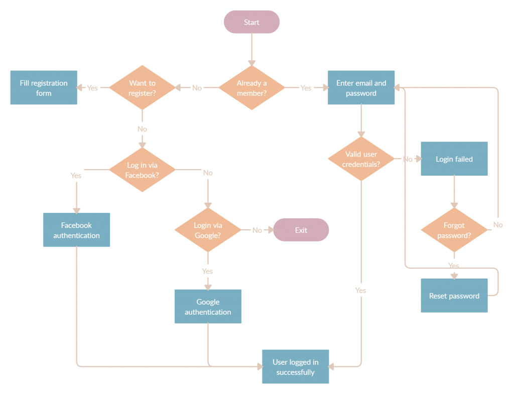
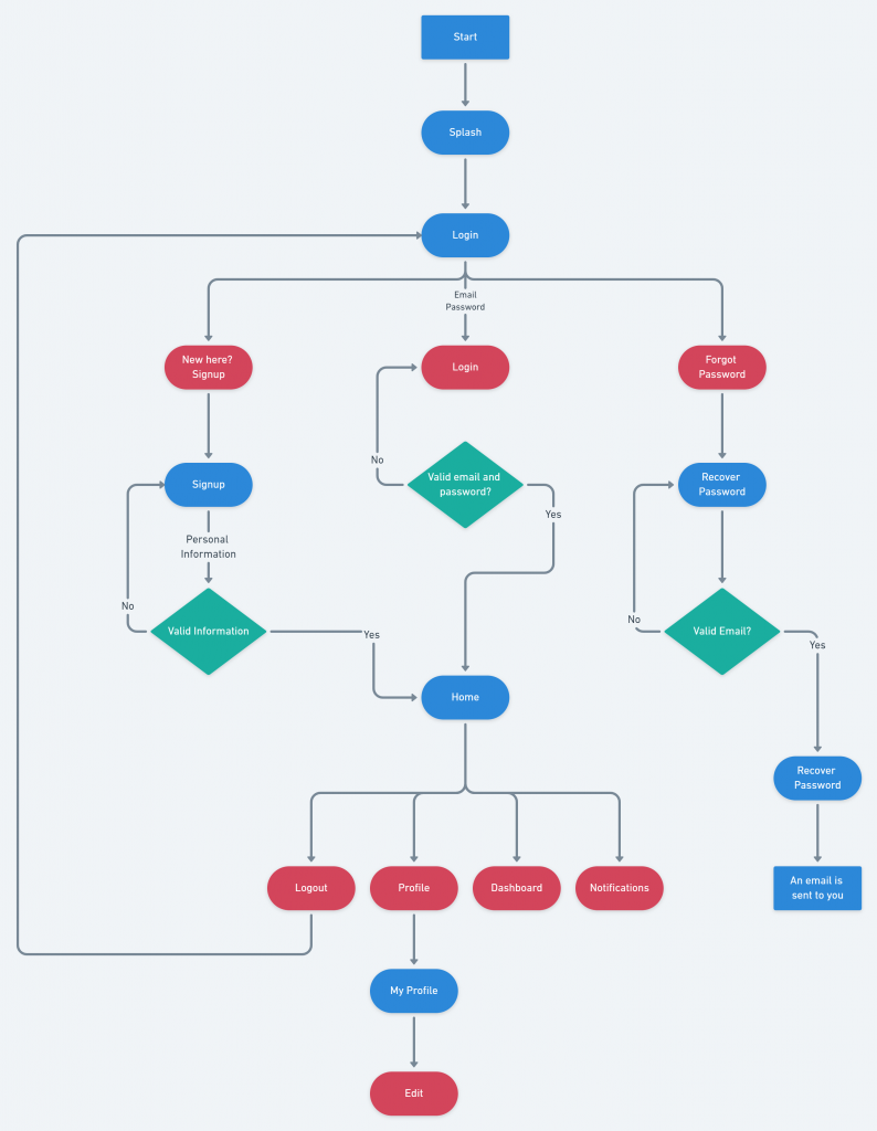
The user flow below shows the progression from opening an app to logging in. It details the possible paths along the way, ie.) forgetting a password, registering an account, etc.
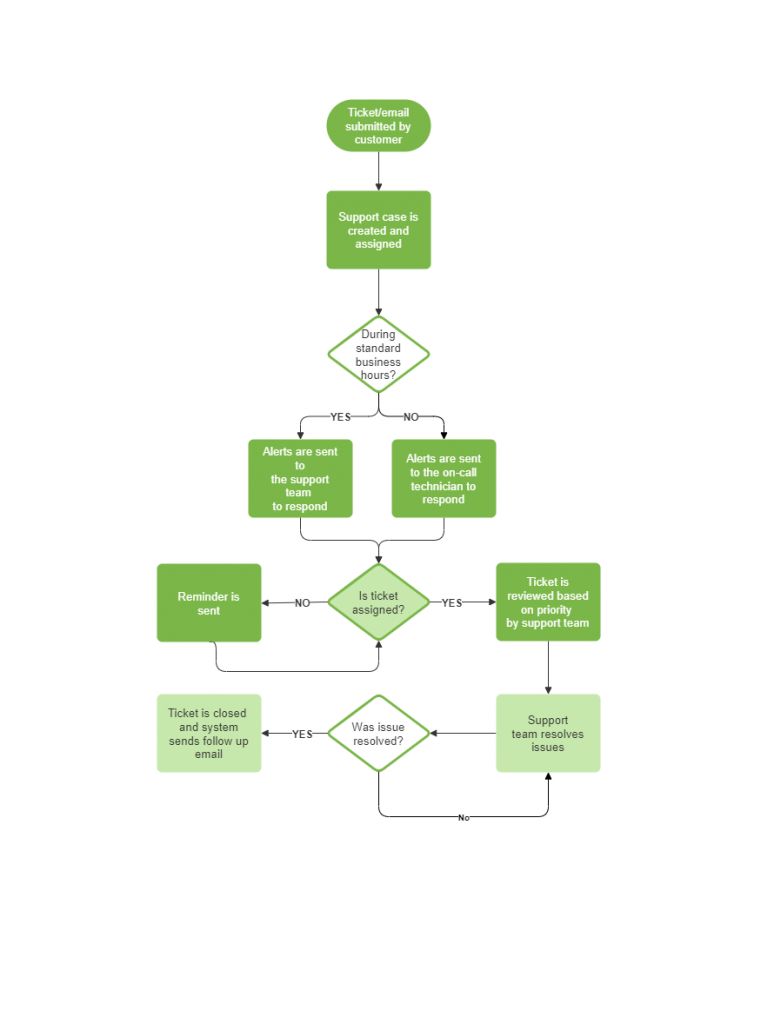
This diagram demonstrates how a user flow covers a focused portion of an app’s functionality. An effective user flow centers around a single goal. In this example, it’s the flow surrounding support tickets.
Even streamlined user flows can account for a breadth of choices at each step. This home screen user flow outlines the choices available to users from the time they open the app to the time they choose their goal on the home screen.
Creating a user flow diagram is simple:
Before you charge ahead in creating an app, take a moment to create an example app user flow diagram. Your users will thank you.
Interested in discussing what a user flow for your app would look like? Let’s talk about it!
Explore Designli's Mobile App Development Services →
You might also like:
Subscribe to our newsletter.

Your users should be at the forefront of your design process. If a user can’t achieve what they want to on your website or app, they will go...

The success of any app depends on two things: how well it meets the needs of its target users and how enjoyable it is to engage with. But this...

Why is it so much easier to be consistent with your workout when you go to your gym vs. exercising at home? And why does it seem so much easier to...
Post
Share